Heatmap

Heatmap

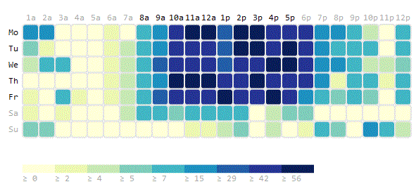
An example of a Day/Hour Heatmap showing concurrent user sessions over time in a development environment. It was generated with WP-D3 v2.1.1 and adapted from http://figurebelow.com/d3/wp-d3-and-day-hour-heatmap/. [d3-source canvas="wpd3-723-0"] [print-me]

Pie Chart

Pie Chart

This example pie chart shows the relative size of various age groups. It was adapted to work in WP-D3 v. 2.1.1 from the original located at http://figurebelow.com/2013/03/13/wp-d3-tutorial-adding-d3-snippet-into-a-wordpress-post/ [d3-source canvas="wpd3-715-0"] [print-me]

Line Chart

Line Chart

This demo chart contains the stock and Bollinger Bands (red) of Ford stocks (blue) between 1-Feb-2013 and 31-Jan-2014 and was adapted from the original located at http://figurebelow.com/d3/short-tutorial-into-wp-d3-v2/. [d3-source canvas="wpd3-709-0"] [print-me]

Box Plot

Box Plot

A box-and-whisker plot uses simple glyphs that summarize a quantitative distribution with five standard statistics: the smallest value, lower quartile, median, upper quartile, and largest value. This summary approach allows the viewer to easily recognize differences between distributions.

Frequency Bar Chart

Frequency Bar Chart

This simple bar chart originally by Mike Bostock is constructed from a TSV file storing the frequency of letters in the English language. The chart uses the following D3 features: d3.tsv – loads and parses data from a tab separated file d3.format – format percentages d3.scale.ordinal – x-position encoding d3.scale.linear – y-position encoding d3.max -[...]